Friday, June 29
Monday, June 18
MARTZI HEGEDŰS - FRUSTRO
Amazing type face by Martzi Hegedűs from behance's Typography Served page.
I'm a big fan of M. C. Escher inspired design. the whole impossibility design I think is so cool.
I had a go at rejuvinating my logo a few months back in this sort of Escher style, almost went with it as my logo until I developed more ideas.
Wednesday, June 13
ATIPO - BARIOL
Quality new font by Spanish design company Atipo.
Quality, clean body font that just works really well. I'll be making an appearance in my new CV and portfolio current being made at the moment.
Monday, June 11
THE INDIAN MINISTRY OF TOURISM - THE HINGLISH PROJECT
Brilliant font by The Indian Ministry of Tourism which combines Hindi and Roman type together.
Friday, May 25
Thursday, May 24
Wednesday, May 23
JOHN BARTON - TERRALEC
Really nice monotone stationary set by John Barton. Love the use of packing tape in the branding too.
Tuesday, May 22
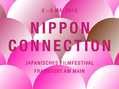
ALEXANDER LIS - NIPPON CONNECTION
This guy seriously knows a strong brand and art direction. Even the colours work so well. Two colours I thought I hated but work so seamlessly in this project. The trend of folding paper was quite an underlying one, never massively took off and never got too big yet designers were aware of it as a trend. It works really well in this project, especially how it allows the videos to show all the sponsors logos in three waves, concealing the logos to reveal the next set and so on. Clever move.
Labels:
advertising,
art direction,
branding,
design,
illustration,
promotional,
typography,
web design
Monday, May 21
JORDAN WALKER - SWEENEY TODD POSTER
Poster I did experimenting with type treatment and also fabricating environments. Placing together stock images and making it look like it was a composition.
BERGER & FÖHR - RECHNER APP
Beautifully simple calculator app for the iPhone by Berger & Föhr. The functions are applied by swiping the screen in different directions. For example, swiping right does addition sums where whiping upwards is the "equals" function.
The colours are really powerful, i'm a huge fan of mono colour design and this is a perfect example.
Monday, May 14
TRAVIS KOCHEL - FF CHARTWELL
A font that makes pie charts. Now this is cool.
Simple by inputting the data on a line of text and then changing the style, it creates really nice, clean, simple pie charts, bar charts, line graphs and more.
"Using OpenType features, simple strings of numbers are automatically transformed into charts. The visualized data remains editable, allowing for hassle-free updates and styling."
Thursday, May 3
JAY-Z - BROOKLYN NETS IDENTITY
The title is serious. Jay-Z apparently designed this. If so I have to give props to the guy.
I posted a while back about Gaspard, one of Justice making a poster for a gig. It seems musicians are delving into the world of design. This is the reverse of what i'm doing. Has to work somewhere along the line.
Tuesday, April 17
THE DESIGN SOCIETY - THE DESIGN SOCIETY JOURNAL
The nice guys at The Design Society have sent me over some pictures of the last 5 issues of The Design Society Journal. I've been in contact with them for the past couple of days seeing if I can arrange to get the whole back catalogue so far sent to me in Endland. The publication is only available in Singapore at the moment and have no online store or plans to create one.
They're been super friendly and it should be getting send within a week or 2!
Monday, April 16
AFTER THE FLOOD - THE TITANIC
Beautifully shown videographic by After the Flood for BBC regarding the disaster of the Titanic.
US - BENGA - WILL NEVER CHANGE
Amazing music video by design company Us. The video uses 960 separate vinyls to create a stop motion wave form on a single bar. The art direction just looks brilliant and simple at the same time.
Tuesday, April 10
JORDAN WALKER.CO.UK
Here is my new website for 2012 if you haven't seen it already. Did it about two weeks ago and forgot to mention it here. Sorry about that.
MATTHEW IRVINE BROWN - MUSIC FOR SHUFFLE
Music made with small clips of the same sounding song or same key and then played in shuffle mode n iTunes. It's remarkably simple looking but works well.
Wednesday, April 4
I BOUGHT #4
1. 14/41
Mash Creative owned Mark Bloom produced a book showcasing his favorite logos from the past 14 years. The book also includes 5 golden rules about approaching brand design. Really nice book design, lovely monochromatic design.
2. Design Assembly Book
I'm still yet to work this book out, I wasn't a huge follower of Design Assembly and to be honest bought the book on it's format alone. It's being hailed as award winning material and book of the year, really should tuck my nose into this.
3. Spiel Issue #3
I think I heard about this through It's Nice That and it was straight up my alley as an independent publication. The design on the fron echos old retro football shirts.
Friday, March 23
ABSTRAKT - CORPORATE IDENTITY 2011
Really nice and simple logo design by Abstrakt. Reminds me of V&A's logo and the simplicity in that.
Subscribe to:
Posts (Atom)


