Showing posts with label typography. Show all posts

Tuesday, July 10

NEAL FLETCHER - BOUWEN TYPEFACE


Brilliantly simple typeface by designer Neal Fletcher. He shows the break down and components of the typeface by creating an almost 'meccano-esq' kit and making a physical version. The photos show how all the fonts are made up of about 12 individual elements. Very childish looking but extremely legible and a brilliant concept.

The bouwen website has a great feature where you can dissect each letter to see which parts are needed to construct each character and also a page to create your own word board, aptly named 'The Playground'.


Wednesday, June 13

ATIPO - BARIOL


Quality new font by Spanish design company Atipo.

Quality, clean body font that just works really well. I'll be making an appearance in my new CV and portfolio current being made at the moment.


Tuesday, May 22

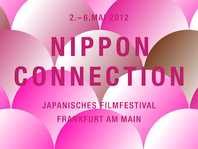
ALEXANDER LIS - NIPPON CONNECTION


This guy seriously knows a strong brand and art direction. Even the colours work so well. Two colours I thought I hated but work so seamlessly in this project. The trend of folding paper was quite an underlying one, never massively took off and never got too big yet designers were aware of it as a trend. It works really well in this project, especially how it allows the videos to show all the sponsors logos in three waves, concealing the logos to reveal the next set and so on. Clever move.


Tuesday, April 17

THE DESIGN SOCIETY - THE DESIGN SOCIETY JOURNAL


The nice guys at The Design Society have sent me over some pictures of the last 5 issues of The Design Society Journal. I've been in contact with them for the past couple of days seeing if I can arrange to get the whole back catalogue so far sent to me in Endland. The publication is only available in Singapore at the moment and have no online store or plans to create one.

They're been super friendly and it should be getting send within a week or 2!

Tuesday, February 28

NICHOLAS "FELTRON" FELTON - THE 2010/2011 FELTRON BIENNIAL REPORT


Every year since the amazing 2007 report i've said to myself, "That would be a brilliant piece of design to hold" and every year, I forget. It got so desperate once that after the facebook timeline event which Nicholas Felton helped design, he re-printed his 2010 book with a limited edition blue cover for 500 prints only and handed them out to everyone who atended the keynote. I think it got to about £70 on eBay before I reluctantly retreated from competitive bidding.

This whole month I was comparing the release dates for the previous reports thinking, shouldn't there be one now? Well, I was bloody happy when over facebook this message pops up:


The very minute that came up on my iPhone. I was up, straight out of bed, straight to his bigcartel site and ordered two. I'm seriously so happy I finally got one. It's like when you're 17 and you spend that whole year waiting to be able to drink in a pub or something (even though you drink anyway) but the principle is there. I waited a whole year thinking "Why didn't I buy it, i've missed out, he's so busy with facebook he wont make another" and then it comes.

Wednesday, January 18

THE CHURCH OF LONDON - THE GOOD TIMES


Nice newspaper created by design agency The Church of London.

In 7 days they compiled a group of designers, illustrators, writers, editors and more to create a feel-good newspaper to release on Blue Monday (supposedly the most depressing day of the year) containing only good news and articles to make the reader feel better.

I love me a good independent newspaper so I've already ordered mine. Nice custom font work in this book too by a desiner called Angus MacPherson, who works at TCoL. 

Tuesday, December 20

A2/SW/HK / GEETIKA ALOK - INDIA


I saw this font a while ago and it's just another piece I can add to the "should of blogged about it" pile. This font was designed by Geetika Alok in collaboration with A2/SW/HK specifically as a bespoke font for Wallpaper magazine to promote their "Reborn in India" issue.

It perfectly melds together traditionalism with modern design. it really caught my eye when I saw it back in May. The only thing that deterred me was the price I think but spending money on a font that only has one purpose, as a headline font. I can't justify it.

That being said, I wouldn't want to tarnish the fact it was designed specifically for a single publication.


Monday, November 21

TOORMIX - TOORMIX PAPER


My copy of Toormix's paper came through the door. A really nice publication, alsmost a zine, from a spanish design outfit called Toormix. Worth a buy.


232 MKSD


THIS FONT IS TAKING OVER MY LIFE!!!

Friday, September 16

JACOB GILLBREATH - CONAN O'BRIEN KINETIC TYPOGRAPHY


I really like this style of videography, a camera moving over a page or composition of text in such a way, it's really great. This may not be the best example but It still looks really creative, the use of minimal colour and the subject is just a all round excellent package in my opinion.

Monday, September 5

PTARMAK - URSA MAJOR BRANDING


Austin based designer Ptarmak brand Vermont based mens skincare company Ursa Major. Really simple design that encapsulates the history behind Ursa Minor, a constellation.

"In Greek mythology, Zeus (the king of the gods) lusts after a young woman named Callisto, a nymph of Artemis. Hera, Zeus' jealous wife, transforms the beautiful Callisto into a bear. Callisto, while in bear form, later encounters her son Arcas. Arcas almost shoots the bear, but to avert the tragedy, Zeus hurls them both into the sky, forming Ursa Major."

Not your everyday soap story.

The book that they can sent out is traditionally bound which is rare these days but a really nice touch. The design holds the angles from the logo throughout the pages too. It's always nice to see thought behind typography.

www.ursamajormen.com
ptarmak.com

Monday, May 16

CENTRE GEORGES POMPIDOU


The Centre Georges Pompidou opened in 1977 and hasn't changed it's logo since then. Why? Because it looks more modern than most of the logos designed this century, that's why. Looking at the images for their advertising and their general art direction, don't you see some similarities to last years design trends? Block colour, narrow lettering? I think I'm going to invest in some French design books as well as some Swiss ones too. I was lucky enough to visit the Pompidou center a few years back when I was too young to appreciate what it was but I still remember the building looking freaking awesome for a block from the 70's.

Thursday, May 5

FONT 2010 & FONT 2011


I thought it'd be a nice idea if I said which font I found myself looking at and using a lot in each year so I came up with this FONT award thing I guess.

Steelfish - 2010
Last year was massive for tall slim fonts, I found refuge in Steelfish which I believe is a rip off of the Pittsburgh Steelers typeface, if not it's very similar. I'm not usually a fan of font copys but as this wasn't so evident, I used it in a lot of logo work.

Dekar - 2011
I found this after getting into Behance and finding myself in need of a nice, clean body text typeface. I like how angled the font is and also the fact that it can even be used in a logo or as sub heading type. It's a perfect all-rounder.

Download both fonts here:
Steelfish
Dekar

Thursday, November 18

Arcane Roots - Left Fire


Great typography work on the debut album "Left Fire" from Surrey Three piece Arcane Roots. I've been listening to these guys non stop and loving the album. You can listen to the album for free on here.

arcaneroots.bandcamp.com/album/left-fire